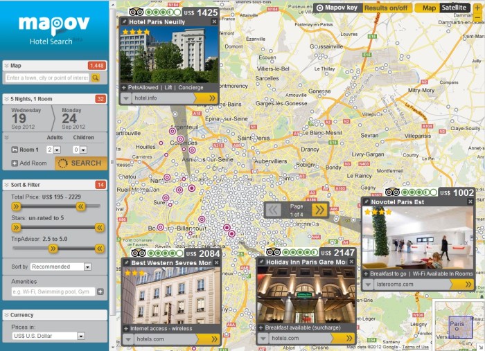
Mapov overlays a map with the top hotels returned by your filtering criteria within the current view.
Startup Mapov combines hotel deals and TripAdvisor review data to inform a novel map-based hotel search. My colleague Troy (an interaction designer) and I looked at the site. We tried our usual Paris hotel search scenario since the number and density of hotels in Paris makes for a good design and performance stress test.
Pros:
- We liked the basic paradigm of the map view with visual representations of the top five hotels from the sort. This is Mapov’s primary differentiator.
- We liked the status indicator on the filters that shows the total number of hotels remaining after each step in the filtering.
- We liked the drop down list of booking links below the hotel photos.
- We liked the Mapov key which indicates availability and filter match for each hotel.
Cons:
- It would be nice to have more sort criteria.
- We didn’t like the visual lag on scroll and zoom.
- The mouse-over scroll within the picture frames is too sensitive and may be difficult for some users. The addition of transport controls (i.e., ‘<‘ and ‘>’) would help.
- We didn’t like the way the vertical date picker list interrupts the user experience on initial search. We get that the designer is trying to make it easy to pick a date range, but it’s more natural for users to choose dates from a calendar control. DealAngel.com has a good design that uses both calendar controls and a less intrusive and more refined linear date picker that is even color coded to show average prices by date.
- It would be nice to be able to click through to a single hotel details page without having to go to a booking site. It would be nice to see review and amenity information in one place instead of only through the amenities dropdown and the TripAdvisor popup window.
- We’re not fans of the color scheme. We prefer a simpler scheme with more white space and less saturated colors such as used at Hotels.com, Expedia.com and Google Hotel Finder. The color of frames around the hotel images doesn’t match the filter area on the left.

The Visual and Interaction Design of the Mapov Date Picker (top) is less refined than DealAngel’s (bottom)
Conclusion
Our overall impression is that Mapov brings some interesting new ideas to the table, but the user experience lacks refinement. The interaction design is jarring at times, as we mentioned with the date picker and the photo scroll-over. It feels like it needs more usability testing with average users and A/B testing to determine which elements work and which should be removed or improved. For Mapov to succeed in an already crowded space, its interface will need to be as refined, uncluttered and fluid as its best competitors. Hotel image/info boxes on a map are not enough of a differentiator to make it a winner.
Tnooz has more background and an interview.